Online Course Development Tips
If you’re new to teaching online, designing a course can seem like an overwhelming task. “Course development” refers to the placement and look of materials, activities, and other content in the actual course site.
Thankfully, our Canvas LMS helps make course development a lot easier. Canvas accomplishes this by imposing certain constraints when it comes to navigation and menus. Even with these constraints, there are a few decisions you will need to make.
Organization of Content
There are three ways to organize content in Canvas.
- Repository Style (Not Recommended): Create assignments, quizzes, files, discussion forums, and pages inside of those specific tools in Canvas, and then point students to the main menu links for those tools where they then scroll through and find the correct document, activity, or quiz.
- Pros: This is the easiest way to get content into Canvas, and it is the first step to any of the other organization styles.
- Cons: Items on their respective tool pages are hard to navigate. Students will want to know what they need to do in a particular week, but using this method, they will see every single document/activity in the course for the entire semester in long lists.This is not how students are accustomed to navigating the internet. There is no way to show relationships between items like materials and assignments, or between specific items and date.
- Module Style: Once you’ve created all of the assignments, pages, quizzes, and forums, you can add them to the Module page in Canvas. Canvas allows you to create modules, name them, add text headers inside of them for context, and indent items to show relationships.
- Pros: This method makes it easy for students to see how content is grouped, be it by topic or by date. Adding already created items to the module view is very easy for you as the instructor.
- Cons: Module view for the entire semester can be overwhelming for some students. The module view does not support the addition of images.
- Page Style: Rather than listing everything on the module view, you can create pages for each week or module of the course and then link to assignments and materials from that one page. Instead of having a hundred plus links on a module view, you would instead only have the pages for each week or module linked either on the module page itself or from a homepage.
- Pros: Allows for a cleaner design with fewer overall links in the course visible to students at any one time. Allows for use of images and illustrations.
- Cons: This is the most time intensive course design method both at initial creation and when revising content in future semesters. Students can get frustrated looking for past assignment boxes or materials because they can’t remember which page those items are on.
Course Homepage
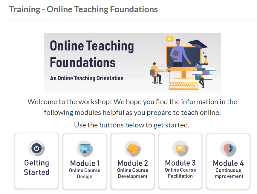
Your course homepage will be the first thing students see every time they come to your course. Here is the homepage for an online training workshop. It is the starting point for every interaction students have with your course. It is important that your homepage emphasize the course name to help students differentiate between their classes.
In addition to adding links to your syllabus, instructor introduction, and start materials, we recommend adding links to your content groups and activities for quick access for students.
Canvas Page Design & HTML
This resource will assist you in adding some of the “fancier” Canvas page elements you may have seen in workshops or in other courses. Instructions include how to add horizontal lines, tabbed interactions, pop-up boxes, shaded boxes for important information and more. Some of these resources and sample code will require basic HTML knowledge, but many can be copied and pasted and edited without too much effort.
Consistency
Be sure when creating your class that you choose a naming convention for your activities, quizzes, and forums and stick with it throughout the semester. If you type a title in all caps in Module 1, then titles in the rest of the modules should be in all caps as well. If you name a forum, Discussion 1, then subsequent forum titles should match that style.
Graphics
Here are some tips for using graphics in your Canvas course. Avoid clipart. It will make your course seem dated. Instead, use free sites like
- Freepik.com (you must provide attribution for anything you use)
- pexels.com (attribution free),
- unsplash.com (attribution free).
Provide attribution for any graphics you use that require an attribution – this sets a good model for students and will protect you from copyright violations.
Avoid using graphics that do not have an instructional purpose. Research shows that decorative graphics actually have a detrimental effect on student learning due to extraneous cognitive load.
Provide alternative text for all images. This will ensure that students using screenreaders will know the content and purpose of the image.
Keep it Simple
Resist the urge to create complicated navigation schemes. Students will quickly grow frustrated if they can never remember where to find something.